Tuesday, 17 December 2013
Music Choices for Idents
The music choice is appropriate and fits with my ident. The rock music I chose for the ident fits well with the theme of the ident and works perfectly with event happening en screen. Due to the direct link between the visual aspects of the ident and the aural aspects of the ident, the audience, will enjoy watching the clip. The ident will appeal to the target audience, however the music choice will enhance this even more. The target audience reflect the personality of the channel and will therefore enjoy the quirky twist to the ident, the pixels. The pixels suit the ident and target audience as they are young and are familiar with technology; this is important as pixels make up the display of computer and tablet screens, the devices the audience will most likely view the ident on.
Friday, 6 December 2013
Mind maps for Idents
We decided not to take this idea further as the majority of our target audience would no longer go out to night clubs and raves.
Also, as the channel plays comedies and youth orientated chat shows, as well as music videos, we didn't feel it would represent the channel overall.
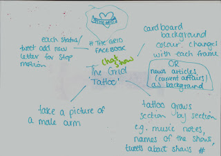 Our second idea, the growing tattoo concept, was an exciting idea however extremely difficult to achieve. We wanted different scenes of Sitcoms, chat shows and music videos to grow out of the tattoo however we decided that a tattoo on the upper arm is a stereotypically male expression and so we did not want the channel to seem male orientated; our target audience is males and females between the ages on 18 and 30.
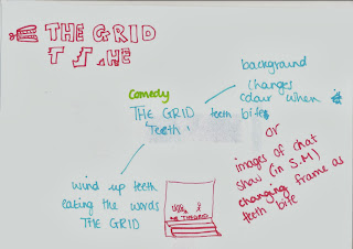 Our third idea, the wind up teeth concept, was not taken further as we did not feel it would represent the channel overall. As the channel shows chat shows, music videos and American sitcoms, we thought having the wind up teeth would represent comedy programs and not the types of programs shown.
Also, as the wind up teeth are a classic joke about false teeth, we decided this was an inaccurate representation of our target audience of 18-30 year old men and women.
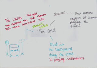 Our fourth idea, the music video themed concept, was carried forward and developed into our final idea. We chose to develop this idea further and create this ident as it was a fun and unusual setting, reflecting our quirky target audience. Not only this however, we used the music video idea to incorporate pixel boxes that show short clips of the programs shown on the channel; this allows the audience to have a sneak peak at all the different
programs displayed on The Grid.
We felt this idea appealed to our target audience well; light rock music was a popular genre of music in the early to mid 1990's, the age in which our target audience were younger and interested in finding their favorite genre of music to listen to. Furthermore, a music video will be familiar to our audience and will therefore catch the attention of the audience and encourage them to watch the programs on the channel.
We felt this idea appealed to our target audience well; light rock music was a popular genre of music in the early to mid 1990's, the age in which our target audience were younger and interested in finding their favorite genre of music to listen to. Furthermore, a music video will be familiar to our audience and will therefore catch the attention of the audience and encourage them to watch the programs on the channel.
Story Board Series
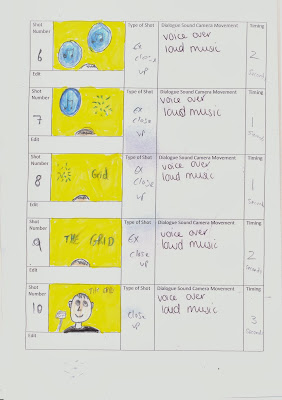
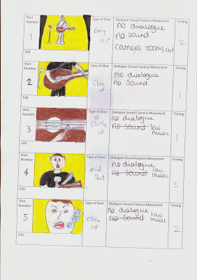
This ident shows a singer/guitarist playing his instrument and singing through a microphone. This ident will begin with no music and then the music will begin at a low volume and gradually increasing the intensity and volume. As the music becomes stronger, the singer will begin to sing to the song playing. Bubbles will come from the singers mouth representing the noise which will then float up and pop to change into the TV channel name.
The mise en scene of the ident will include a dark setting with a single spotlight above the actor. This is intended to focus the action into one place and replicate a concert setting.
Towards the end of the ident will be a voice over introducing the upcoming programs on the channel.

This ident shows an actor with an electric guitar. As it begins there will be no music,
then the music will begin at a low volume while gradually increasing the intensity and volume. As the music becomes stronger the musician will prepare to play the chords to song that is playing in the background.
The aesthetics of the ident include a dark setting with a single spotlight above the signer/guitarist. This is intended to maximize intensity and replicate a concert setting.
The font will then appear from the guitar and break off into many pixels, within some pixels will be clips of the chat shows and other TV shows that are played on the channel.
In the end stages of the ident there will be s voice over introducing the next show due to be played on the television channel.
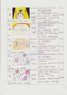
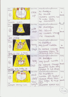

This ident shows a drummer preparing to play his instrument . The ident will begin with no music and the music will be played at a low volume, increasing intensity and volume throughout the ident. As the music become stronger, the drummer will begin to play the beat to song that is playing in the background. From one of the strikes on the drum, the pixels from the font will explode into small squares, which in some include clips of TV shows that are on the channel.
The aesthetics of the ident include a dark setting with a single spotlight above the signer/guitarist. This is intended to maximize intensity and replicate a concert setting.
In the end stages of the ident there will be s voice over introducing the next show due to be played on the television channel.
Thursday, 5 December 2013
Radio station logos: How are they a family?
To begin with the general shape of my 3 logos look similar so that the audience can recognise the 'OW' logos instantly when looking at one of my radio logos. All logos have the CD with the radio name being inserted to be played. This unique similarity shows they are a family as they consist of the same theme. Also I have used a layer filter of bevel and emboss to give each logo a more of a 3D look to it.
Another way in which we can see that they are a family is the way each station plays music genres which target a similar age group.
For this family of designs I decided to name it "Insert & Play". I choose to name it this as the logos show a CD being inserted into a box, representing a music player. On the CD is the name of the radio station so it is as though the CD is the radio station going in to be played.
- VIP FM- Will have a gold crown on to relate to the 'bling' of hip hop artist and relate to the target audience as their fashion style may be similar to hip hop artists. Also the logo includes camera flashes to represent the fame and to give the impression of paparazzi taking photos.
- MIXX FM- Has a Vinyl record player dex surrounded by a mix of complimentary bright colours. The bright colours would appeal to the young target audience and relate to the popular chart music that is usually quite upbeat and can be dance music.
- Pulse FM has an electrifying look to it. It creates a lot of energy due to the powerful green against the black background with red glow reflecting off of it. This set of colours can represent the electronic music genre due to this being the genre of music played in Night clubs; the set of colours can recreate a similar look to the stage lights of lazers etc.
File format for Logos
The
logo will appear as a letterhead, on the home page of the website, magazine and
billboard advertising and a wide variety of merchandise. This means that the the file format must be able to support this. Therefore it would need to be able to change size without becoming pix-elated depending on where the logo will be appearing
This means that it would need to be saved as a Vector based file format. Vector images do retain appearance regardless of size, since the mathematical formulas dictate how the image is rendered. This will allow the logos to look detailed when appearing large up on a billboard, as well as appearing small on a letterhead.
Pdf file format would be suitable as it can be vector based. This means it can use the mathematical formulas to avoid pix-elation of the logos. Also it is a small file size which makes it easy to share through email and it can be opened in all programs.
Tuesday, 3 December 2013
Subscribe to:
Comments (Atom)


